Article by: Lyfe Marketing
Are you doing mobile SEO for your business?
The SEO world has indeed been going through massive changes over the past few years — thanks to the evolving search habits of users around the world.
Major search engines like Google have not only become smarter, but also more specific about the kind of experience they want to provide to users.
And also about what they expect to see from website owners.
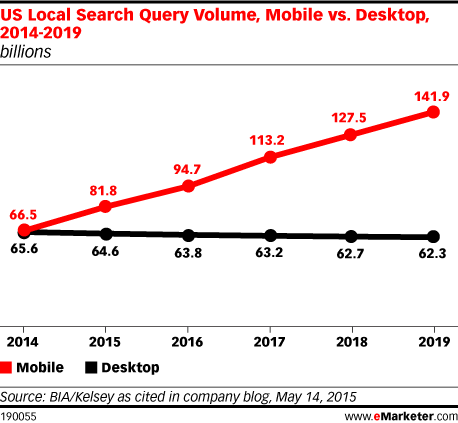
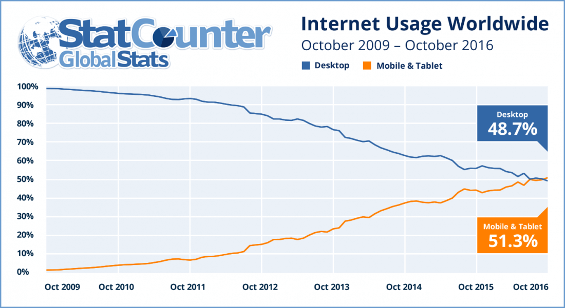
Today, quality SEO is no longer limited to the desktop.
As global smartphone use increases, so do the number of people searching on their mobile devices.
Which is why mobile SEO is a topic that no serious online marketer or business can afford to ignore.

Here’s a look at the current mobile statistics…
- 80% of Internet users have access to a smartphone.
- Users spend 80% of their social media time on their mobile device.
- 69% of smartphone users search on their mobile first when in need.
- An average user spends almost 5 hours on their smartphone.
These stats clearly indicate that people are actively using their mobile device for multiple activities such as gaming, shopping, social networking.
And of course, conducting online searches.
According to research carried out by Mobile Marketer, some popular brands are seeing more than 30%
of their organic search traffic being generated from mobile devices.
And of course, this number is bound to grow with time as the use of smartphones increases.
In another study done by Nielsen on behalf of Google, it was discovered that 93% of smartphone users choose to research a product through a search engine before purchasing it.
So if you are not ranking for your targeted keywords on the first page.
You are missing out on a big chunk of organic mobile search traffic (and potential customers!).
If you want to be found by more people via Google then you need to take a mobile-first approach.
Because that’s the only way you can keep up with the changing trends while staying ahead of the competition.
However, in order to truly achieve a higher position in the search engine result pages for the right keywords.
It’s crucial that you avoid the following seven mobile SEO mistakes.
7 Mobile SEO Mistakes You Could Be Doing
- Slow Loading Pages
- Interstitials Ads
- Blocked Files
- Unplayable Video Content
- Faulty Redirects
- Not Optimizing for Local Search
- Non-Responsive Web Design
- No Rich Snippets
Mobile SEO Mistake #1: Slow Loading Pages
According to a major update announced by Google, page speed is one of the important Google ranking factors in terms of mobile searches.
Page speed is not only crucial for improving your organic rankings, but also for keeping your visitors happy and returning for more.
Additionally, observations show that 53% of people will not hesitate to leave your website if it takes more than 3 seconds to load.
And having a high percentage of page abandonment directly (and negatively) affects how your website ranks on Google.
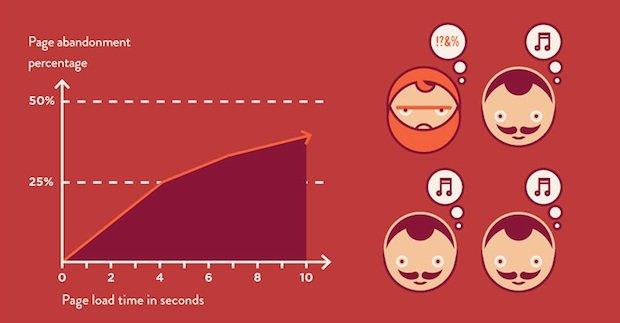
This just goes on to show that your mobile pages have to load at lightning speed in order to make a good impression on both — search engines and your website visitors.
Ask yourself, would you prefer a webpage that takes forever to open or one that loads in a split second?
Here are 3 simple yet useful tips to help you optimize your website for speed and ensure it loads quickly on any given mobile device.
1. Minimize Redirects
Do you use redirects on your website? Consider minimizing them. Because each redirect you use slows down your page load time.
When people access your website via mobile, they’re often surfing on not-so-reliable networks.
Which means your redirects can make your pages load even slower.
Google recommends that you either minimize the number of redirects or remove them entirely.
The most commonly used type of redirect is the 301 redirect (which redirects site visitors to revamped web pages with different URLs).
Even though 301s can be very useful, they can also drain your website’s mobile load time. So avoiding them (if and when you can) makes total sense.

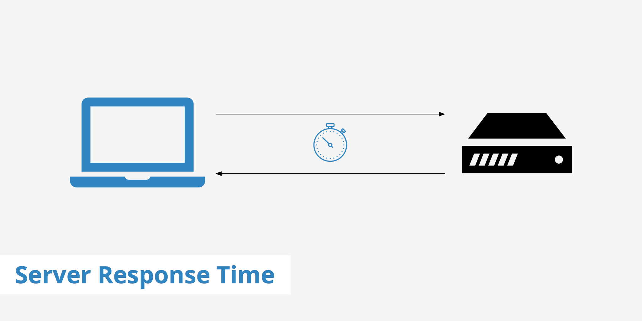
2. Minimize Server Response Time
While mobile page speed greatly depends on your website’s code, it also gets affected by your server.
If it takes too long for your site to respond to a browser’s request, it obviously slows down your website.
Google says that your server should begin transmitting within 200 milliseconds of a received request.
You can improve your server response time by enhancing its configuration or the quality of your web host.
And also by minimizing the resources needed by your site.
3. Minimize Image Size
Images that you use to enhance or support your content can eat up into your site’s overall speed.
Which is why you need to optimize each image on your site, and save those valuable kilobytes along the way.
Try to heavily optimize images that are causing the most problems.
As a rule of thumb, avoid using large images when you are only displaying a smaller version of them.
Also, think about scaling down the resolution of your images to a considerable extent (without affecting the quality).
As doing so can help you reduce the size.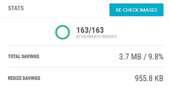
Mobile SEO Mistake #2: Interstitials Ads
Google has made it clear in the recent past that it favors pages where content is easily accessible to Internet users on mobile devices.
If not, the big G will not hesitate to penalize and de-rank your pages.
But what does a mobile-ready website mean?
It means that the website was created with a responsive design and can adapt to whatever device you use to access it.
The pages and functions should perform the same as it is on the desktop version.
Google web crawlers should be able to read every page to be evaluated and ranked by, of course, Google.
So if you don’t want your site’s mobile SEO to be negatively affected, you may want to review how you are using pop-ups and interstitials on your website.
If your site has any annoying pop-up boxes that take over the user’s screen, you may want to tweak your design to make them more user-friendly.
Or even better, consider removing them altogether and shifting the call-to-action somewhere else.
Yes, pop-up boxes tend to convert great for some websites. But you want to use them tastefully so that it doesn’t affect the overall user experience.
If you don’t want to get into the bad books of Google and other search engines like Bing, double-check your use of interstitials on your site.
The following few practices are a strict no-no as they can negatively impact your mobile SEO.
- Displaying a popup box that covers the page’s primary content when somebody visits it via search.
- Showing a standalone interstitial that is forced upon the user when visiting a page; who is unable to vieW the main content without dismissing the said interstitial.
- Designing the page in a way that the main content lies below-the-fold and the standalone interstitial is shown above-the-fold.
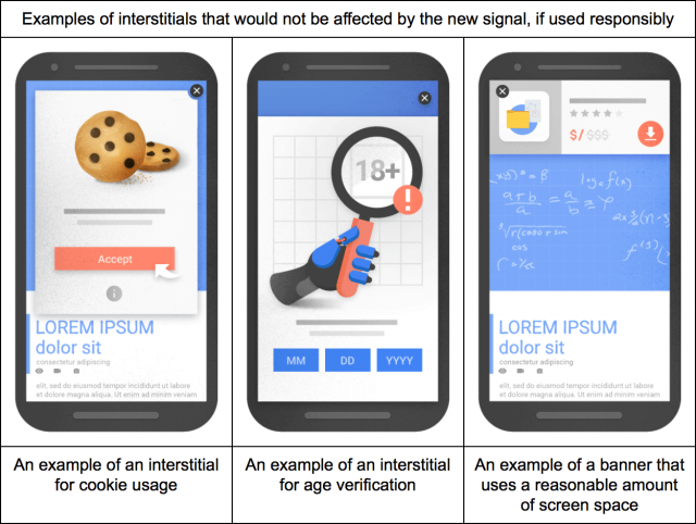
Having said that, Google is a bit forgiving when it comes to certain interstitial ads.
Doing the following will not invite any de-ranking penalty from the search engine giant.
- Using interstitials for verifying the age of visitors (and to inform of your site’s cookie usage policy) is fine since they fall into the legal side of things.
- Displaying any login dialogs containing content unavailable for indexing.Anything unindexable such as paid content, email content, private content, etc. comes under this category.
- Putting up banner ads that do not use much screen space. And if needed, can be quickly dismissed by the user.

Mobile SEO Mistake #3: Blocked Files
Partially blocking Google from accessing your website is not going to help you rank better. Period.
When the Google spiders come crawling your way, they should be able to go through your website like any average user.
If you restrict access to image files and important scripts such as JavaScript and CSS, you not only risk hiding visuals but also other functionalities.
These files add a lot to your website in terms of design and functionality.
If you do not allow Google to see these files even though they are freely accessible to your visitors, you unintentionally send out the wrong signal.
Your site may not be malicious in nature, but that’s exactly what Google will think if you have many certain files blocking its way.
How can you expect the search engine to display your content when it can’t even trust your site?
This is how you can go about fixing this issue on your website:
First and foremost, before you fix any files, use Google’s Fetch tool to identify the files that are blocked.
Prioritize the ones that you need to unblock so that Google can have access to important functionality and content.
You can take care of any other blocked pages after that.
Secondly, run your site through Google’s mobile-friendly test to see if the robots.txt file is responsible for blocking important files.
Because if it is, then Google won’t know if your website is mobile responsive/friendly or not.
Mobile SEO Mistake #4: Unplayable Video Content
Thanks to the growing importance of video content marketing, and people’s demand for more videos.
It’s no surprise that most websites today use video or multimedia content.
However, before you add any type of video content to your website, consider two important things:
- If the video content will slow down your website’s load time.
- If the embedded video is playable on all major devices.
Since there are a few types of videos that cannot be played on mobile devices (eg: videos that require Flash).
You need to be doubly sure about embedding any video content.
Or else, the unplayable video content can affect your site’s mobile experience, annoy visitors and ultimately affect your mobile SEO efforts.

To be on the safe side, Google recommends including video and animated content using HTML5 standard tags, and avoid using the default video player.
Last but not least, include a transcript of your video wherever applicable.
It not only helps visitors access your videos from any browser but also lets Google effortlessly index your pages.
Mobile SEO Mistake #5: Faulty Redirects
Mobile users visiting your website deserve to have a great experience just like desktop users.
However, if you look around you’ll notice that this just isn’t the case.
Due to many websites choosing “lazy coding” over “good coding”, they do not redirect a user’s request over to the mobile site.
Instead, the user is directed towards the mobile version of the site’s homepage — even if he or she is looking for some other page.
The worst part is, some sites ignore the importance of mobile users altogether and redirect them to error pages.
Informing them they can’t access the site via a mobile device.
Ask yourself, is this an acceptable user experience for a perfectly working website? Not at all.
Remember, Google wants to give the best experience to its users at all costs.
So don’t be surprised if the search engine penalizes your site for delivering a poor user experience.
These are some of the areas that you can work on to make sure redirects aren’t hurting your mobile SEO.
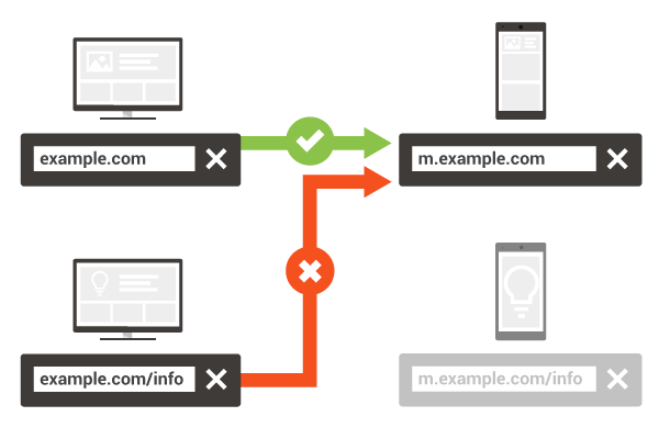
- Redirect mobile users to the mobile version of a page in case they open the desktop version of your site.
- Avoid redirecting users back to the homepage of your mobile site; it’ll only confuse them further.It’s alright if you don’t have a mobile version of your site ready yet.
Go ahead and take users to the desktop version instead. This ensures the user experience of your site isn’t affected.
- Regardless of the mobile device your visitor is using, make sure you serve the same content on every device.
- If mobile users request dynamically generated URLs on your site.Then direct them towards a proper mobile URL where they can easily access the information they were looking for.
When it comes to detecting faulty redirects, you can take advantage of Google Search Console and fix them there and then.
All you need to do is enter your website’s URL and Google will shoot back an email containing list of pages with bad redirects.
Mobile SEO Mistake #6: Not Optimizing for Local Search
People nowadays seek assistance of Google to find places of interest near them, a trend that continues to grow at warp speed.
The fact of the matter is, if interested mobile users are unable to find relevant business information about you, you can lose up to 50% of sales.
This is a mobile SEO mistake that can prove to be expensive for your small business.
Whether it is your physical address or phone number, your potential customers should not have problem finding your information on their mobile device.
With so many local searches happening, optimizing your website for local SEO is a no-brainer.
But this needs to be done while keeping mobile users in mind.
Because today, 18% of local searches conducted on smartphones lead to a purchase within 24 hours.

When you have your website show up for local mobile searches, you only increase the chances of generating more business.
For instance, if you are a dentist looking for patients in New York City, then you not only need to optimize for target keywords, but also for your location.
Also, by registering your business with Google My Business, you’ll be on your way to better mobile SEO.
This way, you will be reaching out to a higher number of potential customers by helping them find you at the right time.

Here are three more things you should do to improve your visibility in local searches…
- Update Local Listings: One aspect of local SEO that many people ignore is the importance of having current information listed on your website.
Every small business that has a local presence should ensure its website(s) has been updated with the right information. - Add More Direct Data: When it comes to creating a more detailed About page.You need to go beyond the typical direct data you find on sites such as name, address and phone number.
If you are a restaurant, you can add more direct data such as your opening and closing times, pricing of your food, delivery options, etc.
- Leverage Voice Search: With the advancement of Google Android and Apple iOS, smartphone users now have the option to search with their voice.When compared to searching by actually typing your query, people use voice search in a different way.
Which is why optimizing for voice search can help you get the most out of your mobile SEO.
Optimizing your website for local search isn’t rocket science. But when you actually do it, it can have a significant impact on your mobile SEO.
Mobile SEO Mistake #6: Non-Responsive Web Design
Mobile devices are taking over the world, and they’ll continue to do so.
No wonder search engines like Google are going with the trend and moving towards a mobile-first index.
It has been seen time and again that people who prefer using smartphones instead of desktop computers are more in numbers.
When people are openly dependent on their mobile devices, responsive design shouldn’t be seen as a luxury.
Rather, it should be viewed as a necessity. If you want to up your mobile SEO game, then you will have to take responsive design seriously.
Now, Google may be powered by its advertisers but the search engine is constantly focused on its users.
Its first priority are people who are using it to search the web day in and day out.
The big G knows that more and more of its users are using their mobile devices to connect to the Internet.
So it’s only natural for the company to give a higher priority to websites that give a better experience to mobile device users.
Websites that are putting in real effort to become mobile responsive.
If you’re still unsure about the benefits of SEO you gain from making your website mobile responsive, here are a few reasons to convince you.
- Better Site Usability
Let’s face it, people like websites that are easy to access and navigate around.
If your site looks like a mess on a mobile device, do you think people will hesitate to move to something else? Of course not.
‘Time on Page’ is a crucial metric in the eyes of Google.
Because it tells how much value a website is able to deliver and how relevant it is to a given search query.
When your website has a mobile responsive design, it’s not only simpler to navigate but is also easy on the eyes.
And we all know how a better user experience is directly related to the time someone spends on your site.
- Lower Bounce Rate
A website’s bounce rate is yet another factor to keep an eye on because it’s related to time on site.
Google not only pays attention to how much time someone spends on a page, but also how many people hit the back button and leave the site.
So yes, user behavior is important to Google as it gives critical information about your site.
The metric that calculates session duration and user engagement is known as “Dwell Time”.
Which is a data point used by Google to understand the quality of your content.
It helps the search engine rank or de-rank a page.
So if your page has a short dwell time (meaning more people leave your site as soon as they visit it).
Google will see it as a signal that your website lacks relevant content for the given search query.
- Higher Social Sharing
Every website that wants more engagement and traffic needs higher social sharing.
A website that has a responsive design makes social sharing easier for mobile users, helping you build and grow your audience.
This can indirectly help your site rank better in the search engines as more people get aware of your brand and search for it.
Mobile SEO Mistake #7: No Rich Snippets
Most of the time you search on Google, you should notice that some listings are different than the others.
They’re more attention-grabbing and visually appealing.

The “different” listing with added information is known as a rich snippet.
Gone are the days when search engine result pages only included basic information about websites.
Rich snippets allow search engines to give more information to the search user.
Which can directly impact the click-through rate for the given listing — especially on mobile devices.
Google creates rich snippets by automatically extracting relevant information from your website and by making the search listing richer.
Besides the page title, description and URL, a rich snippet includes additional info such as images, star ratings, etc.
Regular on-page SEO tactics such as internal link building and optimizing header tags are easier to implement.
Rich snippets, on the other hand, are not-so-easy to implement, which is why you don’t see many sites applying this solid on-page SEO tactic.
However, simply adding more information to your website’s search listing can attract the attention of your target audience…
and in turn boost the click-through rates by almost 30%.
Don’t Make These Mobile SEO Mistakes
Now you know better, so you know how to correct any mistakes you have made regarding mobile SEO.
And you can also avoid these mistakes in the future.